BEFORE and...

AFTER... Atlas of Colour

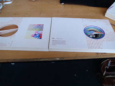
The Navigation of my Atlas of Colour is conducted though a combination of three techniques. The first is the use of colour coding to illustrate a sequence. The second is a DNA mechanism which navigates with both size and layout. The individual keys of the DNA double helix form a continuous spiral that guides the viewer through the book. The chance in size of the circles also illustrate a sense of distance, logically the view reads the closest or largest circle first and so on and so forth, hence this is the last of the three techniques used to navigate the viewer in my atlas of colour.
Construction & Material
The Atlas of Colour is Primarily constructed out of thick mounting boards. This is classified as a very heavy form of paper. Unlike other cardboards and paper types, mount boards are no where as flimsy, this allows my Atlas to stand on the table with ease. However, it is also a very heavy material, and requires very strong bonding to withhold its weight. My tactic to counter the disadvantages of the material was to utilize a slightly different way of binding the book. instead of binding individual sheets, I sandwiched a thin sheet of ultra thick transparent plastic book cover in between two mount boards with double sided tape. Unlike using thin flexible paper, plastic exhibits far more tangible and flexible particles. This allows it to withstand much more wear and tear, very suitable for heavy duty bonding books.
Image Balance
Although the DNA mechanism was efficient in navigating, it created problems itself too. The main problem was that every page would have a whole that got bigger and bigger after several pages. This made the layout far more difficult to plan and required series thinking. My solution was to use a consistant continuation of subtle dots from the face map to re-balance the weight and colour of the page.
Consistancy was emphasized in many aspect of my atlas. This was largely due to my precedent study where I realised how difficult it was to navigate and find information when the layout is inconsistant. Examples of my consistancy would be the use of subtle dots, concentric circles, image polarization and even the continous use of constantine binding methods.
The face map is a crucial focus on Rem Koolhaas and the book navigation. Rather than just transforming the face into a map, I find it more important to make the work serve its purpose, I.e. a map used to navigate. This is essentially conducted through the use of dots and repetition and manipulation of the European Face.


3D Colour Wheel Edit
As Recommended by the tutor, I re-photoshopped the image to make the "orange" capsules more orange and "purple" capsules more purple.
By polarizing an image I can emboss either the vertical or the horizontal aspects of an illustration. This is essential when featuring certain aspects of a pattern for example.


